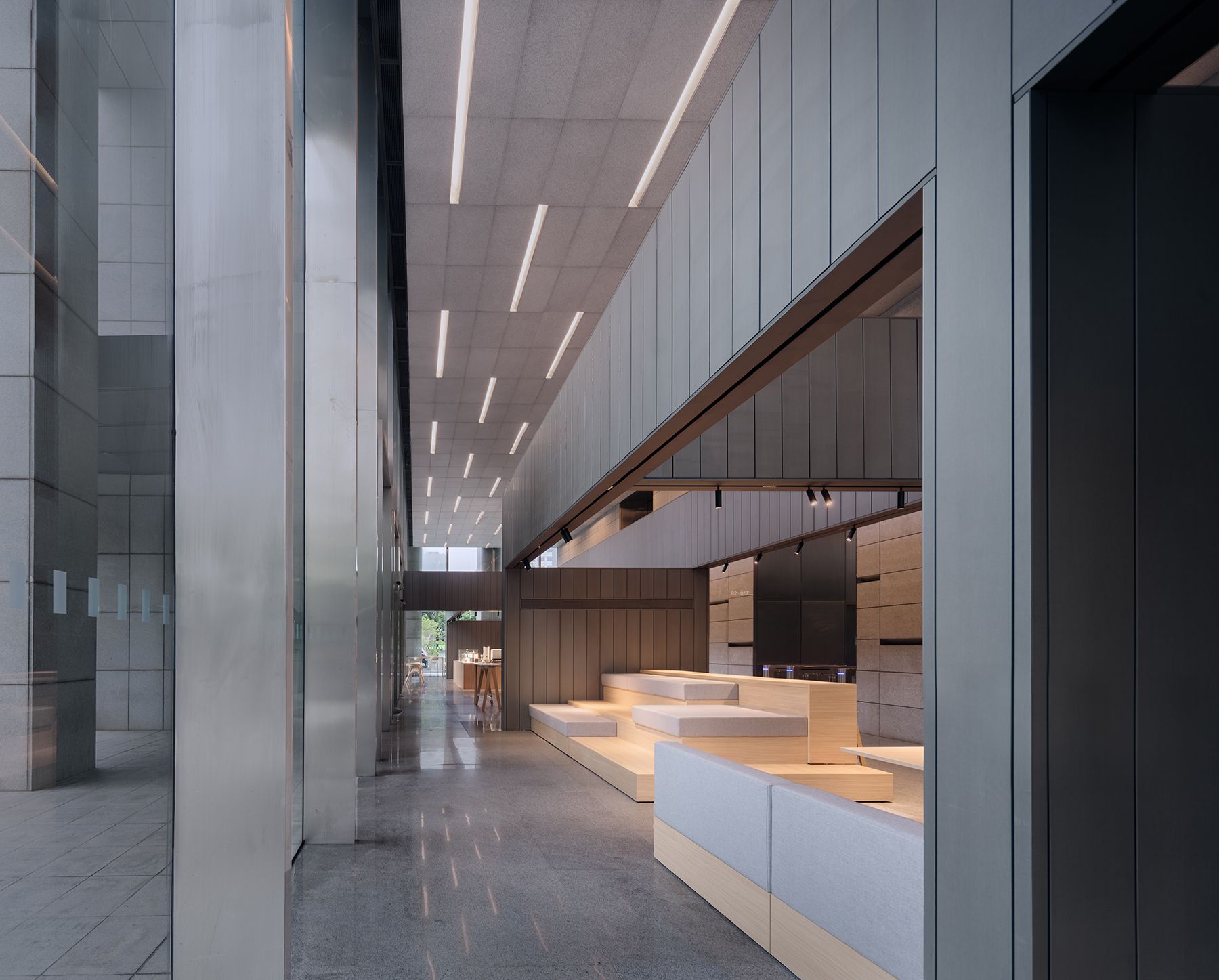
入口望向钛锌板覆盖的超尺度前台
这里是上海被称作老西门的地方,黄浦中心大厦就在这里。
Huangpu Center is located in the place known as Old West Gate in Shanghai.
从地图上看,它所处的路口拐角即分别是人民路与中华路,方浜中路与方浜西路的分界点。人民路与中华路围起上海的老城厢,方浜中路往东直通向城隍庙,而往西不过一公里多开外就是新天地。每天,熙熙攘攘的人流穿过这里。
From the map, it is located at the corner of the junction where Renmin Road meets Zhonghua Road and Mid-Fangbang Road meets West Fangbang Road. Renmin Road and Zhonghua Road enclose Shanghai's old city quarter, while Mid-Fangbang Road leads eastwards to the Chenghuang Temple and westwards to Xintiandi just by about 1 kilometer. Crowds of people passes through here every day.
吊灯矩阵下的问询区
两组黑色家具组成接待区
2020年,一切发生改变。从暴发到持续,疫情成为城市生活中常态化的存在。与其说是影响,不如说所有人都接受了这种改变,建筑作为包含人们日常行为的重要场所也不例外。
Things changed a lot in 2020 that from outbreaks to ongoing, epidemics become a regular presence in urban life that the change has been everywhere. Architectures that go with people's everyday life are of no exception.
前台南端的闸机出入口
如果按照门牌号码来认识黄浦中心大厦,可能会觉得这栋高楼的入口有些隐蔽。楼栋与街道之间分布着呈斜线状的宽阔绿化带,绕过绿化带,方能见到通往大厅的玻璃门。
It is a bit hard to find if trying to recognize Huangpu Centre by its building number. Only after walking around the wide green belt that runs diagonally between the building and the street, the glass door that leads to the office lobby could be seen.
从东厅进入西厅
原本在底楼的东侧和西侧分别有两个出入口,人们可以不受阻挡地自由进出,现在则因疫情防控,限制人员流动的需要,西侧楼门关闭,底楼区分出东、西两厅,东厅增设闸机筛查外部来访人员,电梯厅与西厅的接口处也设置了闸机进行管理。
There were 4 main entrances in the lobby, 2 at the east and 2 at the west, and people could use all the entrances to enter and exit freely before the epidemics. Due to the need of epidemic prevention and control later, the 2 west entrances are deactivated temporary and the office lobby is divided into 2 parts, east part and west part respectively. Additional brake gates are newly set in the east part to screen visitors, the same as the brake gate between west part and the lift lobby.
折线形高桌组成的交谈区
从完全的开放到一定程度的封闭,在接受这种改变的同时建筑内的环境和氛围也发生变化。于是,在赢得大厦底楼门厅更新改造竞赛之后,“创造一定封闭下的公共性”成为在此项目中将完成的课题。
From complete openness to a certain degree of closure, the environment and atmosphere within the building changes accompanying when starting to accept the change. Therefore, winning the competition of the office lobby renovation became a new topic on ‘how to create publicness under certain degree of closure’.
望向公共办公区 ©梁山
墙划分下的公共办公区
走进东厅,首先看见的是一个超常规尺度的前台,它的长度几乎等同于整个门厅在南北向上的距离,与室外的城市道路形成对应,将建筑放在了可与城市对话的位置上;它也是应用在此项目设计中的一个重要概念:“墙”。
The first thing you see walking into the east part is an oversized reception whose length is almost the entire distance of the foyer in north-south direction, corresponding to the city streets outside. In this way the building is placed in a somewhat equal position with the city. It is also a key concept implemented in the design of this project: the 'wall'.
公共办公区望向西厅北端
 公共办公区西侧通道
闸机位于前台南端,服务人员的工作区则安排在靠北侧,人们进入门厅即按照写字楼员工、来访人员进行了分流。这个以“墙”作为表现形式,以城市尺度搭建起来的前台,既承担东厅的功能性,也表达出建筑服务于个体的意象。
The brake gates are arranged on the south end of the reception while the service staff area lies on the north side. As entering the building, the traffic is diverted to employees in the building and visitors. In the form of a ‘wall’ and built at an urban scale, the reception not only undertakes the function of the east hall, but also expresses the willingness that the building serves the individual.
公共办公区多种形式的家具
从东厅“进入再进入”西厅,到达整个流线中更为“内部”的区域。相较于东厅,这里用更多片墙构造出更小尺度、更适合人们进行日常活动的空间,由“规定”过渡到“选择”。
Enter from the east part and then reach the west part where the real internal area is. More pieces of walls are used to create a smaller space that is quite suitable for people’s daily activities. In this way, the transition between "stipulation" and "choice" is realized.
咖啡区望向大堂西厅
十米挑高之下,将墙以悬空、立体并弥漫的方式排布,在不同方向上“可视”而给人一种“充满”的感觉。
The walls are built in overhanging, 3-dimensinally solid and diffuse way so that they could be seen from different directions when standing in such a 10-meter-high lobby, a feeling of ‘fullness’.
西侧通道望向公共办公区“台阶”
西侧通道望向咖啡区吧台
超常规尺度的墙构造出与日常感无二的功能空间,包括小型会议、灵活展览、公共服务、自由交谈、咖啡店、休息娱乐、独立办公等,自南向北满足从集体活动到个体活动之间的不同层次,彼此连通又互有区隔。可移动家具使空间的公共性得到最大程度的利用。
The unconventional scale of the walls forms an ordinary daily space. The functions include quick meetings, flexible exhibitions, public services, casual conversation, café, open lounge, etc. Connected and separated, the new space satisfy both group needs and individual activities from south to north. In addition, the movable furniture provide the most of the public nature of the space.
公共卫生间入口望向咖啡区吧台
东、西两厅共十一片墙采用钢结构覆盖钛锌板,以建筑的方式在室内搭筑起来,尺度超常但仍带给人正常感受,非常规的组合手法使小空间包含的日常活动获得安定氛围。
There are total 11 pieces of walls in all of which are made of steel covered with titanium zinc panels in the lobby. The walls are built up in an architectural way indoor. The scale of these walls is extraordinary, yet they bring a sense of normality. It is this unconventional combination that provide ordinary daily activities in such a small public space, bringing a rare ambiance of peace.
卷帘落下时咖啡区多样的座位
卷帘落下时公共办公区的沙发
“墙”作为项目的重要构成元素,组织动线、构造空间,容纳了整合水电暖通多种设备管线等现实需求,并赋予建筑以服务的特性、对话城市。如果抽离出项目,它既是具象元素又是抽象概念,经过多次对称呼的讨论,最终确定了“墙”。
The ‘wall’ as a key component of the project that it not only helps to organize movement and structure the whole space and accommodate practical needs such as integrating of plumbing, electrical, heating and ventilation and other equipment pipelines but also endow a serviceable character to talk with the outside environment. Picking the ‘wall’ out of the project, it is both a figurative element and an abstract concept. And the decision of use the term of ‘wall’ was made after times of discussion.
钛锌板覆盖的墙体
黄浦中心大厦建成于2010年,当时的门厅设计依据建筑外立面的形态和构筑手法,采用花岗岩为主要材料。此次门厅更新改造则依据原建筑室内设计,提取灰色花岗岩及拉丝不锈钢材料,采用与石材立面模数相关的元素“墙”,虽改动较少,但通过超现实展示方式,创造一个新的尺度,使空间感受获得强改变。
The Huangpu Centre was completed in 2010. At that time, the interior design of the lobby was based on the form and architectural approach of the external façade, choosing granite as the main material. Meanwhile, the renewal is based on the original interior design by picking up two materials which are grey granite and brushed stainless steel, as well as the important element-‘wall’ corresponding to the modulus of the stone façade. Without lots of changes in material, the immersive experience of being inside such a space with surreal scale is excitingly amazed.
室外望向咖啡区
室外望向公共办公区
在一定的封闭下,让建筑富有公共性——当这栋楼宇的每一位使用者都不断享用这种公共性,随之而将形成对建筑的场所记忆。
Working in a building with such public character in a certain period of time due to the closure, as each user of the building continues to enjoy and share publicness, new memories of the place are thus growing.
|
 - 手机版 - 小黑屋 - 园冶杯国际竞赛组委会
( 京ICP证090434 )
  - Design: Mobanbus
 - 手机版 - 小黑屋 - 园冶杯国际竞赛组委会
( 京ICP证090434 )
  - Design: Mobanbus